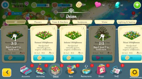
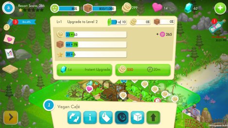
The biggest undertaking that I have taken part in since I arrived has been adapting an iPad UI into an iPhone UI. The game UI had been purpose built by Sprung Studios for iPad and, in my opinion, succeeds in giving players something beautiful and tactile to interact with.
So the two biggest things to take into account when working with the smaller screens of the iPhone family, or any phone, are text size and button size. Poorly sized text will be a strain to read, can look out of place, and can lead to a detrimental user experience all round. Button size is also a major factor. You have a lot of space to work with on an iPad to make buttons clear and tactile, unfortunately this doesn’t always translate to screens with smaller real-estate. If the buttons are too small, the player may end up needing multiple attempts just to press the button. If the buttons are too big, they take up that valuable screen space that may be needed elsewhere.
The bonus in countering those two issues was the fact that Sprung Studios had already supplied us with a full suite of UI art and design. So All I really had to focus on was small tweaks to text and button sizes, rather than overhauling the structure and placement of the assets.
So before I get into technical details, I’ll explain briefly how I went about the adaptation. We needed bigger text for the body of the windows. All those goal introductions, building information, character text, and anything else that wasn’t a title needed to be bigger. 36pt font size ended up being my go to text size for all of those, moving up to 40 or 50pt depending on the emphasis a window header needed. Same thing with buttons, I landed at using 160px on average across the buttons because that was recommended by Apple. Now, on to the technical details!
After a bit of research, I found that the desired button size for the original iPhone was 44×44. The first iPhone also had a ppi of 163 on a 3.5” screen, giving the button a real world size of just under 2/5 of an inch. Using this we can calculate how many pixels we needed to give to a button at iPhone 6 Plus size. Using super math, we can determine that 2/5 of an inch on an iPhone 6 Plus screen is about 160 pixels. Using that as a base for a button size, and using Unity’s UI systems to scale down buttons depending on screen resolution, we came to a comfortable minimum button size across all screen resolutions and aspect ratios for iOS devices. What was handy was already having a UI designed and implemented on iPad with buttons that, more or less, fit the size requirements. Also a little tip for this process, any time I wanted to see how a button could feel, I saved the file out as an image and emailed it to my phone. You can get a really solid idea of how your button is going to feel if you actually throw it onto the device you are developing for, even if it isn’t interactive.
Moving on from there it became a case of finding the right text size to comfortably portray all the information we needed across all of the boxes and windows of text that the game has to show. Using Apple’s recommendations of a minimum of 12pt (points) font size, I set about building a window and using that size on the body of text. This threw up an issue with regards to how Unity and iOS process pt sizes. See the iPhone calculates screen pt and screen resolution differently, the standard iPhone 6 Plus has a screen resolution of 2208×1242, but it also has a pt resolution of 414×736. So 12pt fonts are calculated on the pt resolution. However, Unity works differently. It renders everything onto pixel resolution. So a 12pt in Unity converts to a 4pt font on iPhone 6 Plus. This point means that text would have to be set at triple the required pt amount in Unity. This meant setting the vast majority of text in the game to 36pt, which had a knock on effect of requiring larger windows/boxes on iPhone than iPad, despite the larger screen real-estate of an iPad.
After all of that, it became a process of slightly tweaking window sizes so the new text size fit as nicely as it does on the iPad. Not a lot of technical detail here. It was mostly scaling up a few pixels here and there and exporting the image to an iPhone. Some icons needed a bit more space between them, so they got it.
All in all, I feel the iPhone UI strikes a lovely balance between comfort and usability.
For those looking into the same process, here are a couple of links:
The iPad UI was designed and created by Sprung Studios, you can find them here: http://www.sprungstudios.com/
They make awesome stuff so go check them out.
Apple’s own tips and tricks for designing iPhone UI:
https://developer.apple.com/design/tips
A very handy site with little nuggets of information for designing iPhone UIs. While not all applied to the work I was doing, it certainly is useful information moving forward.
A page detailing the differences between iPhone screens:
https://www.paintcodeapp.com/news/ultimate-guide-to-iphone-resolutions.
This page was open in my browser for the entire process. Excellent information for anyone requiring information on points and pixels, the differences in ppi, how some screens downscale, and how they all compare side by side.
Another page full of guidelines for developing for iOS:
https://designcode.io/iosdesign-guidelines
This was a site I had used in the planning stages for the whole process. While it has a lot of information which isn’t pertinent to what I was doing, it was an eye-opener into the detail with which Apple approach their own design mantra.
Cheers!
Kevin McGarry


